Design System at Meditech
Within a new product, creating components to bridge the gap and afford consistency
Context
I joined Meditech at the start of a major project: a full rebuild of its Laboratory Information System. Meditech is the third-largest hospital EHR vendor, and Labs—along with Imaging—was one of the first apps to get a complete redesign from the ground up. Everything was open: code, workflows, IA, and visual design.
The company had recently launched a new design system team, but it is still being built and has very few components. This meant the Labs team had to find a solution, and create our own components while staying consistent across eight designers and multiple workflows.
Problem
Few components existed in the new design system
Eight designers were creating patterns independently
Inconsistencies started showing across workflows
Components had to be clear, usable, and accessible for clinicians
Needed to respect MEDITECH’s existing design system while building new patterns
Contrast ratios need to be sufficient to follow WCAG
My Role
Designed reusable UI components for the Laboratory app
Worked closely with the Atrium design system team
Made sure all designs were accessible (WCAG 2)
Helped the Labs team create consistent patterns across workflows
Designed key components like laboratory flags and pill-shaped tabs
Currently collaborating on a specimen card component
Labs teams would make their own design system to alleviate theirs design needs, while supporting the development of the new design system.
Because the new product needed it, we developed reusable components in order to satisfy the needs of all the teams.
These components were then adopted within the design system.
Solutions
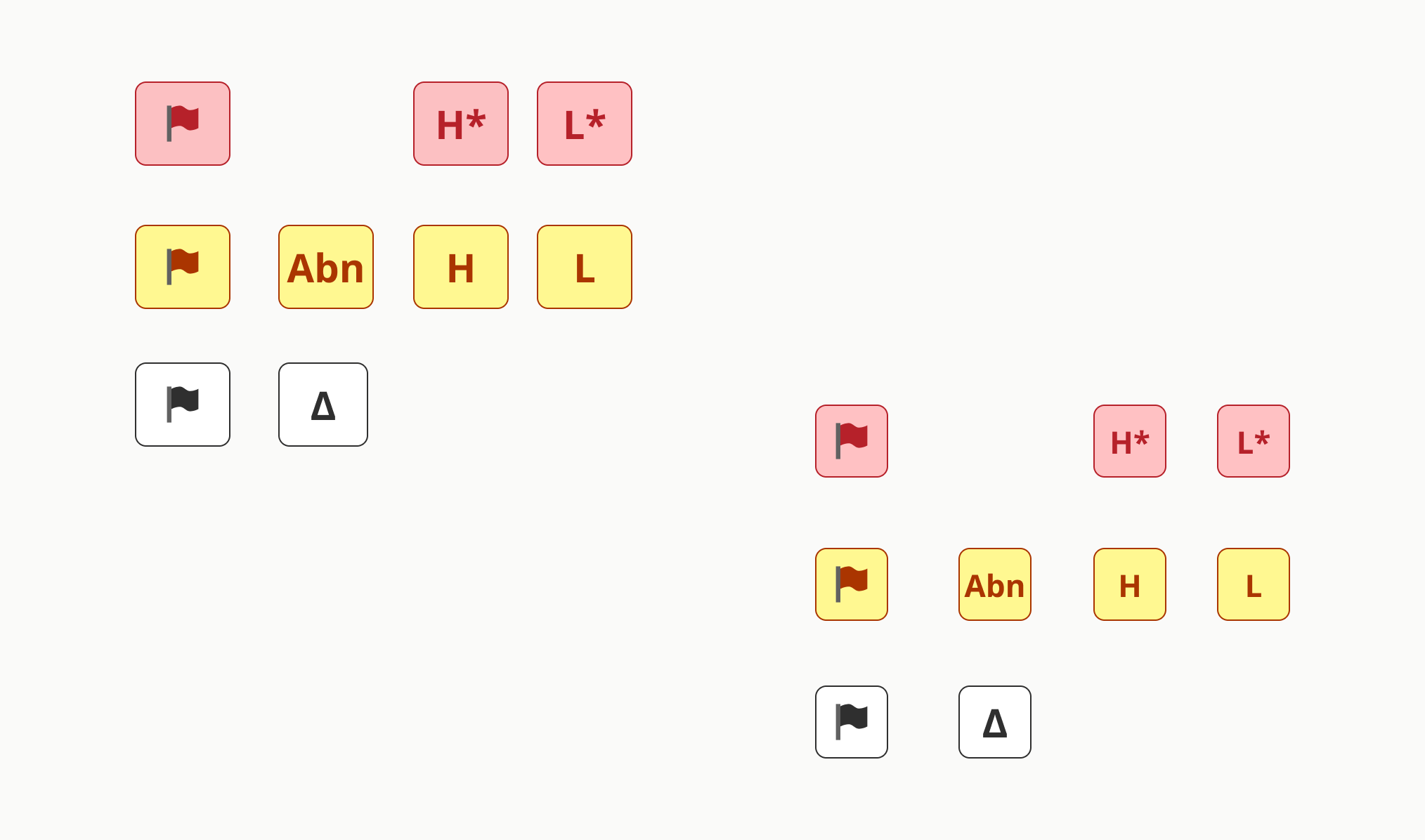
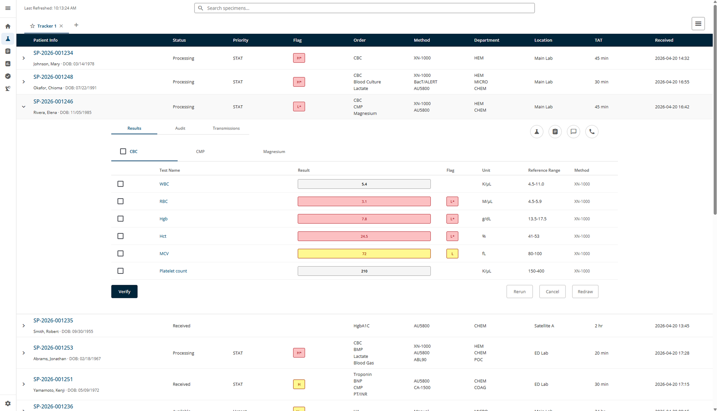
Laboratory Flags
I designed a set of flags to indicate lab results quickly and clearly:
Critical Low / High
Abnormal Low / High
Abnormal
Delta
Error
Key goals:
Quick recognition in fast-paced clinical workflows
Text labels + color for accessibility
Reusable across result lists, worklists, and detail views
Clear hierarchy: critical flags stand out more
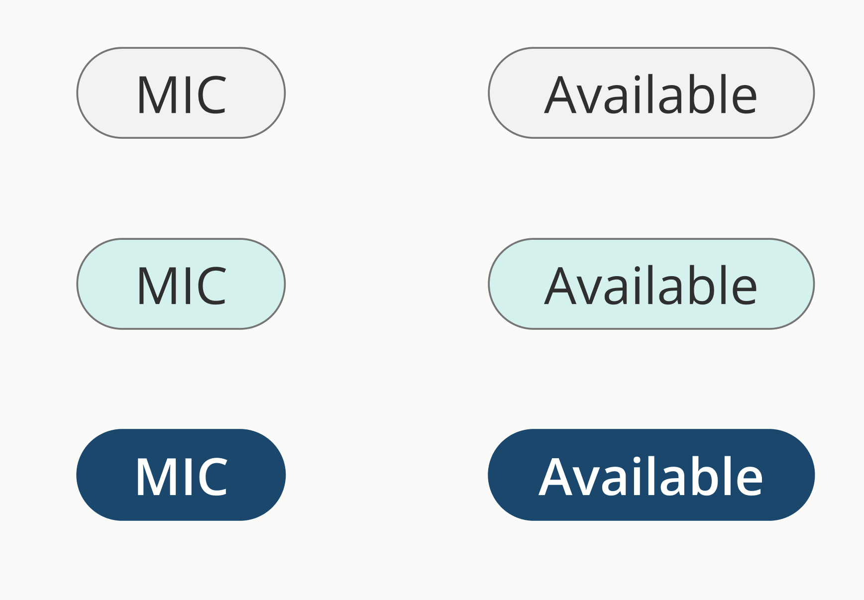
Pill-Shaped Tabs
Pill tabs organize information across lab workflows.
Key goals:
Hover, click, focus, active, and disabled states
High contrast for readability
Clear focus indicators for keyboard users
Flexible pattern so other designers could use it consistently
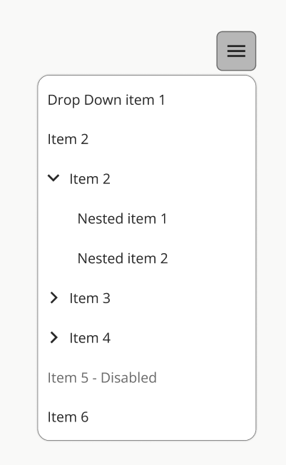
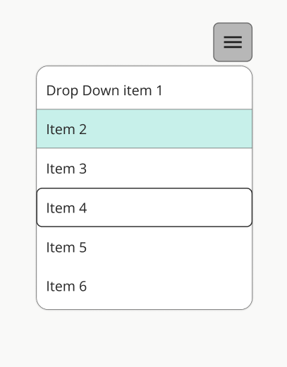
Dropdown component
Dropdowns are a key component of most screens, especially data-intensive ones.
Key goals:
Have a hover, clicked, disabled, and keyboard accessible state
Designing with accessibility contrast ratios
Screen reader accessible
Flexible patterns so other designers can apply it consistently
Team Collaboration
I also worked closely with the other Lab designers to:
Identify overlapping patterns
Consolidate solutions
Build shared components
Currently designing the specimen card component as a inter-team effort
Pain Points
Very few existing components in Atrium
Defined colors that do not afford sufficient contrast
Multiple designers creating different solutions
Accessibility requirements for clinical use
Balancing speed with long-term system consistency
Aligning new components with legacy patterns
Designing foundational components from scratch taught me the importance of thinking system-first. Small elements like flags and tabs appear everywhere, so getting them right early matters a lot.
Working closely with the design system team and my peers also showed me how collaboration helps maintain consistency—even when building something entirely new. It’s rewarding to see small, well-designed pieces have a big impact across a complex healthcare application.